Dashboard
The ConBop dashboard is the main entrypoint for you event. Giving high-level information about your event and how you event performing. Some key areas are
Sections:
Attendee Engagement
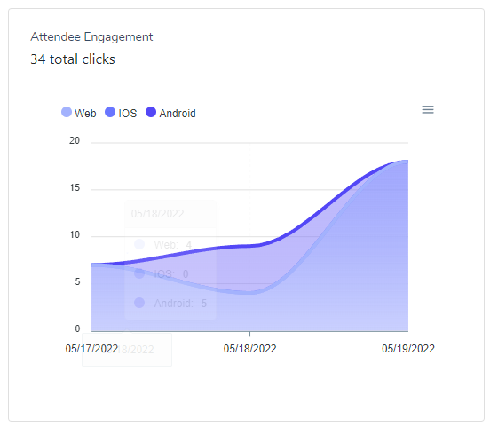
Attendee engagement graph shows how much interaction your event is getting, during a specific date range. This graph will indicate how many click or tap actions your event has received. While the total clicks is the aggregate of all devices, you can easily view the device breakdown as well. Showing how much interaction your event is getting based on a specified device type
Device Breakdown
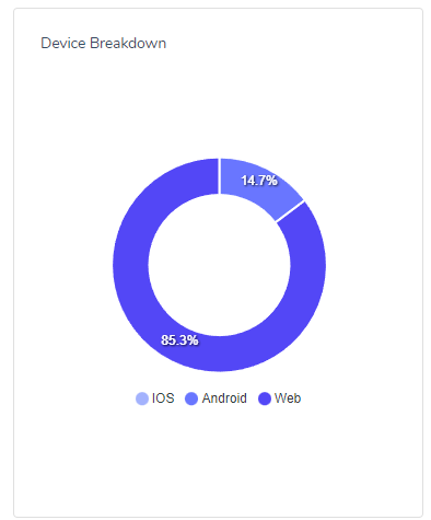
The device breakdown is a listing of each device who accessed your event during the designated time period. The device breakdown will show
- IOS
- Android
- Web
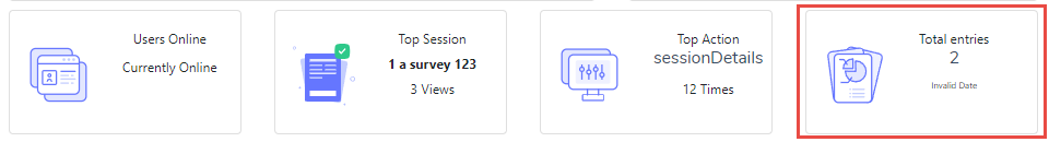
Users Online
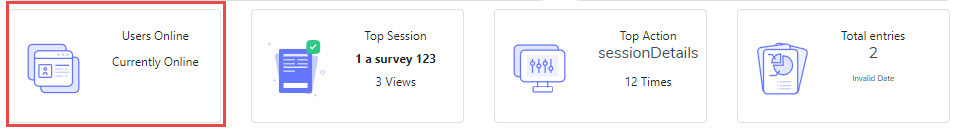
The users online section the current number of attendees who are active in the app, this is an aggregate over all devices.
Top Sessions
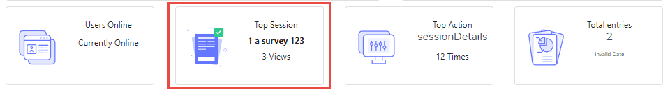
The top sessions section shows the most popular session, given the specific filter date. This will also indicate the number of times the session has been ‘clicked’ on during that timeframe.
Top Action
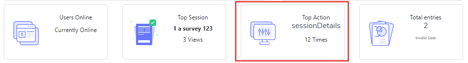
The top action will display the most frequent action in the app given the date filter. This can include things like ‘Session Details’ or ‘ App Open’