Home Screen
The home screen section allows you to control how the main app screen will display, allowing for
Sections:
Home screen type
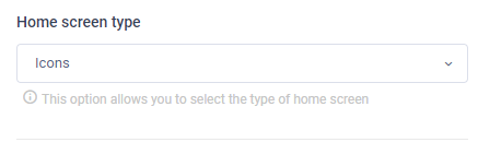
The home screen type drop down allows you to select how the main app screen will display. [This is the main home screen after log-in]
The drop down has 4 options to choose from
- Icons
- Image tile
- Image icons
- Page builder [beta]
Icons
The icons option will simply use the default icons, and can be configured under the ‘App appearance > Home Icons’ section. This setting works in conjunction with the icon shape, allowing you to select round or square icons
Image Tile
The image tile option will change the ‘Home Icons’ section to allow for images to be used for each section defined. The image tile is a pre-calculated mason grid that will adjust the images based on width and height [This is calculated by the width and height of images, depending on screen size the placement of images may differ]
Image Icon
The image icon option is a combination of the Icon and Image tile option, allowing you to use an ‘Image’ inside the ‘Icon’. This allows for similar functionality as the Icon option allowing you to upload your own ‘images’ as the icon that is displayed in the same square or round icon background.
Page builder [beta]
The page builder option will use the new ‘Page builder’ section. Currently in Beta, the page builder option give very granular control over the look and feel of your home screen. Allowing you to add things like sliders, upcoming session etc.
Note:
Note: Page builder is a more complex configuration experience, however can give greater control over the look and feel. Currently, page builder is in an open beta phase, should you encounter any issues or have question please let send an email to your account representative.
Icon shape
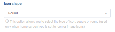
The icon shape section allows you to select from two options
- Round
- Square
Depending on the selection, the icon shape will be ‘Round’ or ‘Square’. If the round option is selected the icons will display with a ’round’ flat-color background with the selected icon or image in the middle.
If the ‘square’ option is selected, it will display as a square background that has a semi-gloss overlayHome text color
The home text color option allows you to change the text that display directly under the icon. This can be any ‘Hex’ color.
Home text background color
The home text background color is only valid when the home icon selection is set to tile. By default the tile option will show the icon text as an overlay for each tile (image).
This option can be any ‘Hex’ color and should provide good contrast between image and text colors.Icons per page -phone
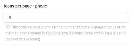
The icons per page phone setting controls how many icons will display per ‘slide’
When a home screen type is set to ‘Icon’ or ‘Icon image’ the listing of icons will be placed in a ‘slider’ allowing for multiple pages of icons’ This option allows you to control how many icons will display in each slide.
This option will control how many icons display per slide on a phone.
Icons per page -tablet / web
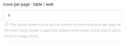
The icons per page phone setting controls how many icons will display per ‘slide’
When a home screen type is set to ‘Icon’ or ‘Icon image’ the listing of icons will be placed in a ‘slider’ allowing for multiple pages of icons’ This option allows you to control how many icons will display in each slide.
This option will control how many icons display per slide on a tablet / web.
Pagination indicator color
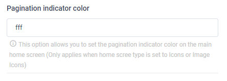
The pagination indicator color allows you to control what color the pagination indicator color is. The indicator color can be any hex color and is only valid when the home screen type is set to icon or icon image.
Pagination indicator location
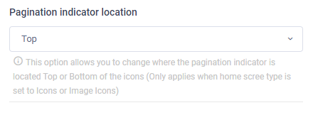
The pagination indicator location allows you to control where the pagination indicator will display. Allowing you to set ‘Top’ or ‘Bottom’.
Setting the option to top will display the indicator above the icons.
Setting the option to bottom will display the pagination indicator under the icons.
Show left navigation
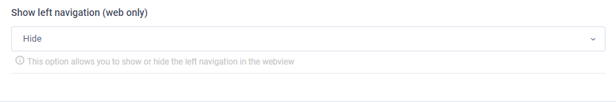
The show left navigation will determine if the ‘left’ navigation will display on the web app. By default, the left navigation will be show in the webview, however, setting this option to hide will hide the left navigation, presenting a ‘hamburger’ menu in its place. Allowing for a ‘full-screen’ experiance.